I was lucky to be one of the guest artists at the Code+Art Student Visualization contest at NCSU library recently, where parts of my generative art work Clocks were displayed. In preparation for the show, I wrote specific pieces for the space, which uses a large screen made out of Christie Micro-tiles. These are modular screens which can be used to construct large and even irregular displays. While the Micro-tiles gave me the largest amount of screen real-estate I’d ever worked with, they posed their own challenges. In particular, the luminance tends to vary between tiles in such a way that art works with predominantly white backgrounds can be distracting, since each tile making up the whole screen will appear at a different brightness. The effect is less noticeable when darker colors are supplied.
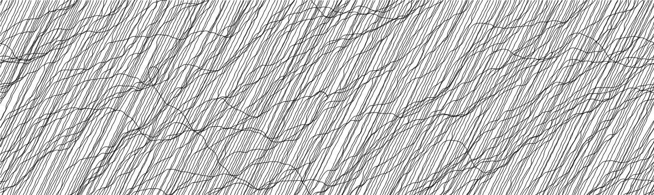
During these discussions, it was suggested that using dark backgrounds might help get us away from “the thin line aesthetic” so predominant in generative art. I agree, thin lines, typically dark on white, are extremely common in generative artworks. But here I will say a few words in their defense.
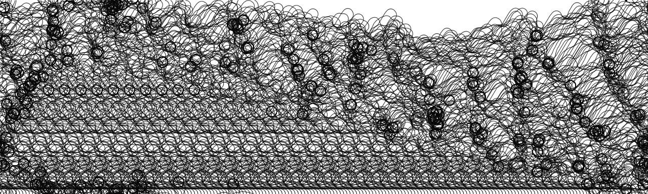
Clock 10 is a thin-line clock. I’ve had occasion to think very carefully about why this clock works as a generative art piece, and it is typically the clock I talk about when talking about the project as a whole because it has a relatively simple, but non-trivial, account. Briefly, Clock 10’s charged particles want to distribute themselves evenly over the face of the clock (since they are all positively charged, and hence repel one another). The clock hands persistently frustrate this tendency by moving particles from the second hand to the hour or minute hand. As such, the particles are constantly seeking, but never attaining, their low energy equilibrium state. Critically, there is not just one such equilibrium state: there exists a family of states related by symmetry transforms (continuous and discrete rotations).
What this boils down to is that Clock 10 traces out the symmetries of the ground states. This is why, if you let the clock run for a half hour, you see concentric rings appear: these rings are the places that particles would like to be modulo rotations, were they allowed to find those states without interference.
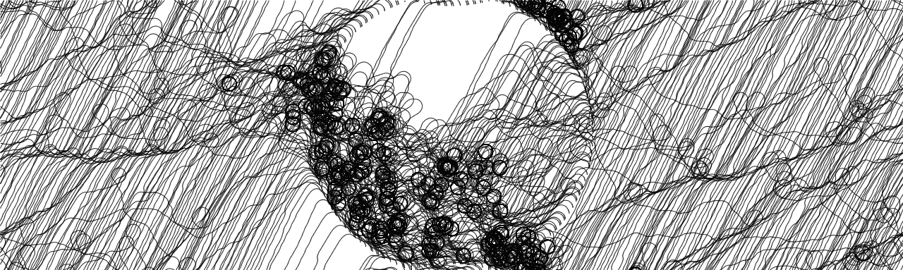
A few aesthetic choices support the relationship of Clock 10 to this interpretation. The color of the trace left by each particle is adjusted in such a way that it only darkens as the particle settles down, so that paths near equilibrium are dark while those far from it are white. And, of course, we use thin lines, which allow lots of information about those trajectories to appear on the face of the clock.
I am a barbarian, so far as artistic pedigree is concerned, but if Clock 10 lives anywhere in the landscape of the practice of generative art, it is in the school of Complexism. Complexism suggests one role of generative art is to explore complex systems. In the sense the Clock 10 is an aesthetically pleasing visualization of the ground states of a certain physical system, it meets this criterion. And thin lines help it operate in this way because they allow us to see a lot of different trajectories in a small amount of space. They give the clock non-trivial texture: tendencies of the motion can be apprehended at a large scale while details of the motion are still discernable.
I tried a variety of other ways of visualizing the trajectories, but none were particularly satisfying because they obscured the fine-scale variations in a way which significantly reduced the information content of the visualization. Part of the impact of generative art is that it imitates nature, to an extent, in that it can compound over and over again many fine motions. The accumulation of so many effects is part of the immediate perception of a work, and undermining it undermines one of the fundamental advantages of using computers, systems capable simultaneously of great precision and great, repetitive patience.
So use thin lines! Or, if you are seeking alternative aesthetic choices, try to find ones which capture the same benefits, packing lots of precise detail into the image in such a way that larger trends are also made visible.